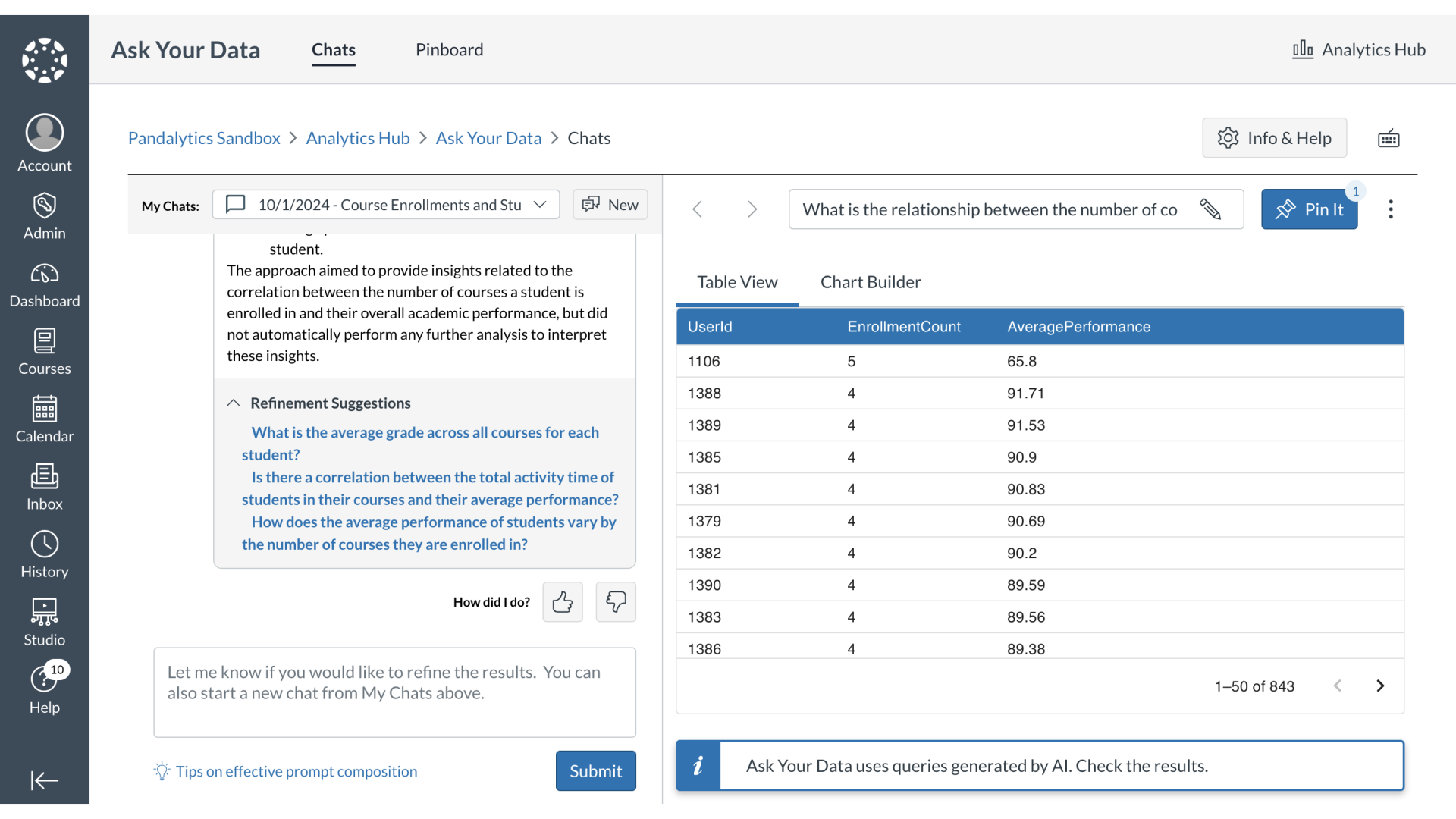
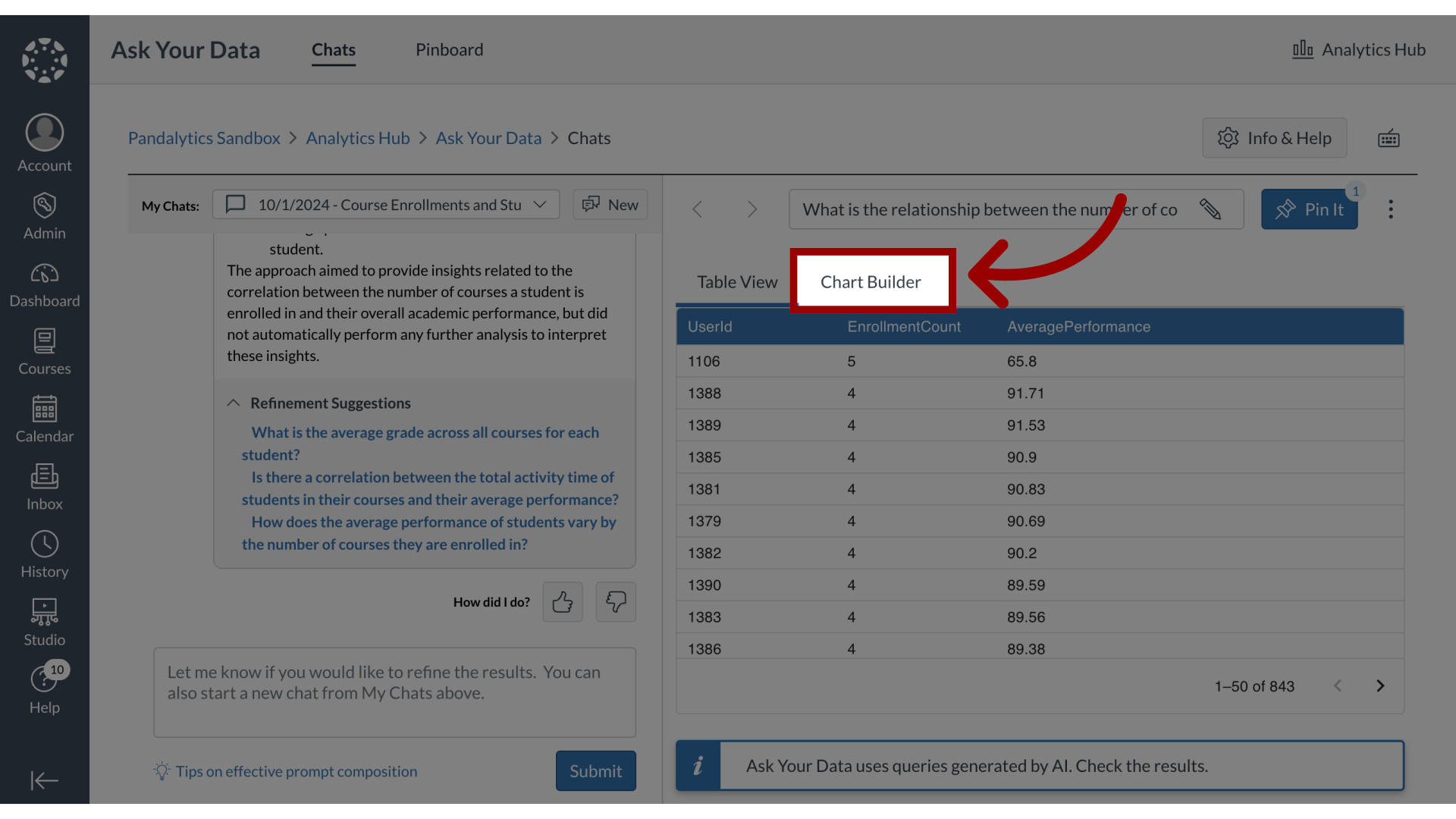
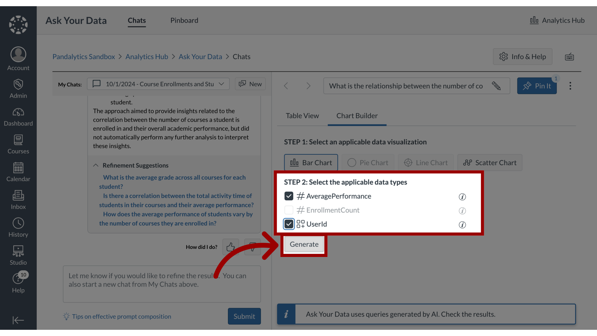
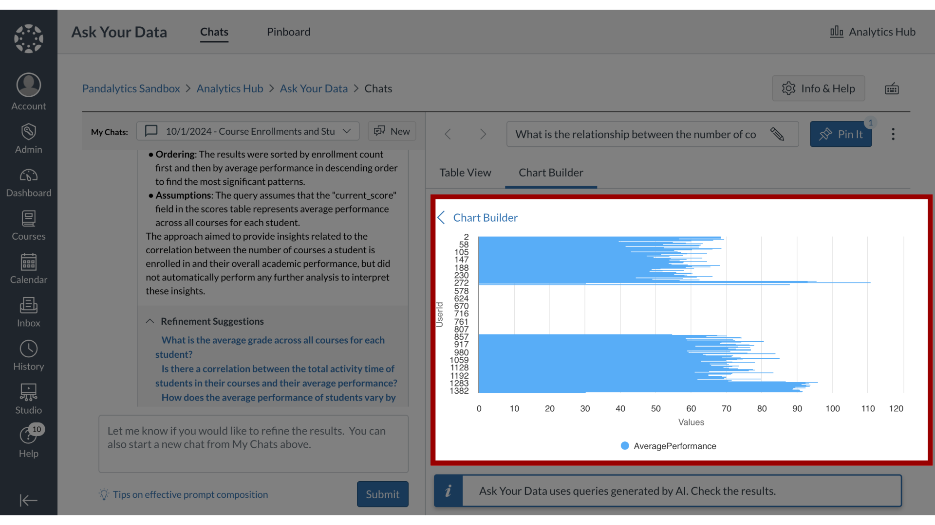
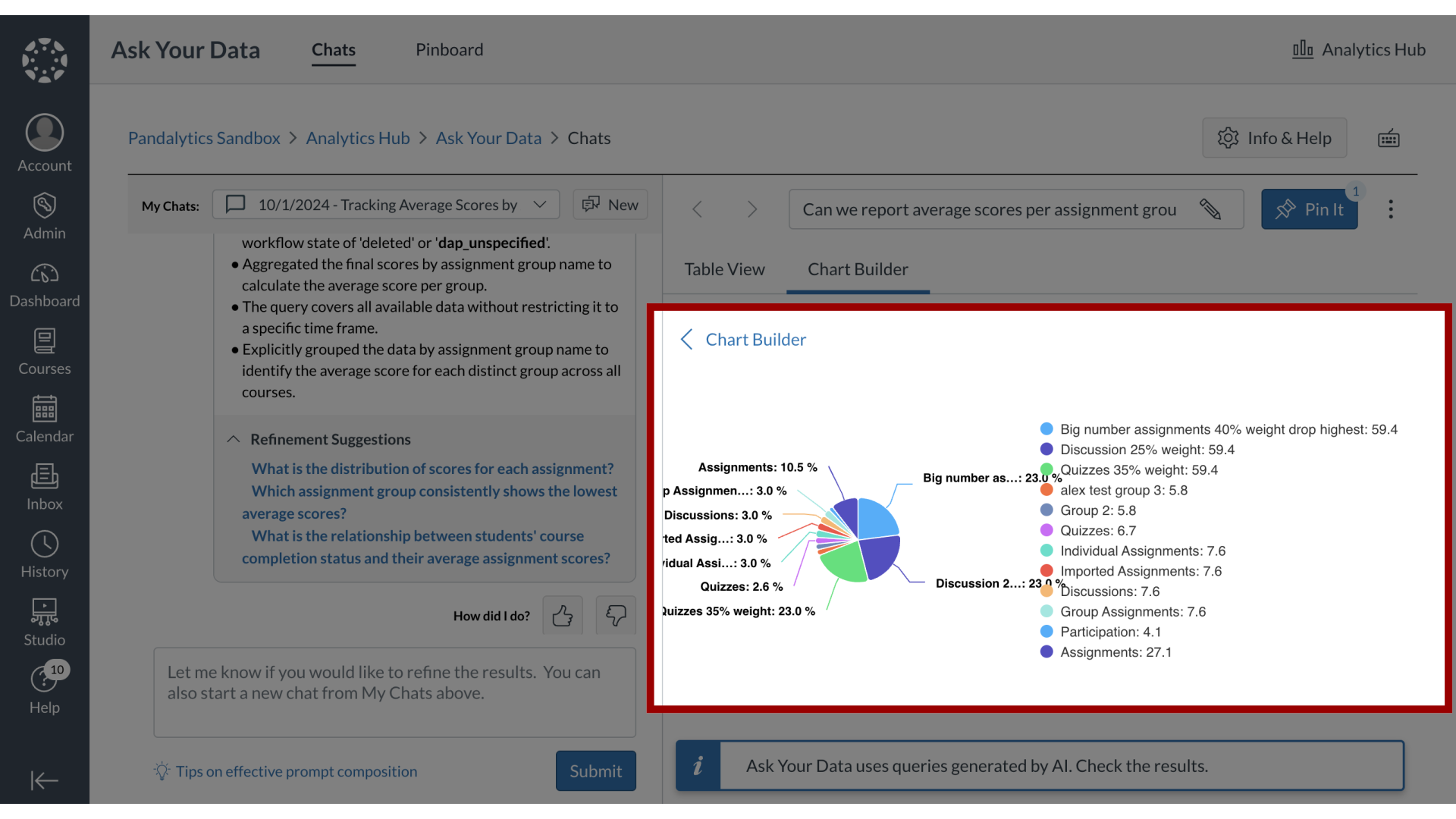
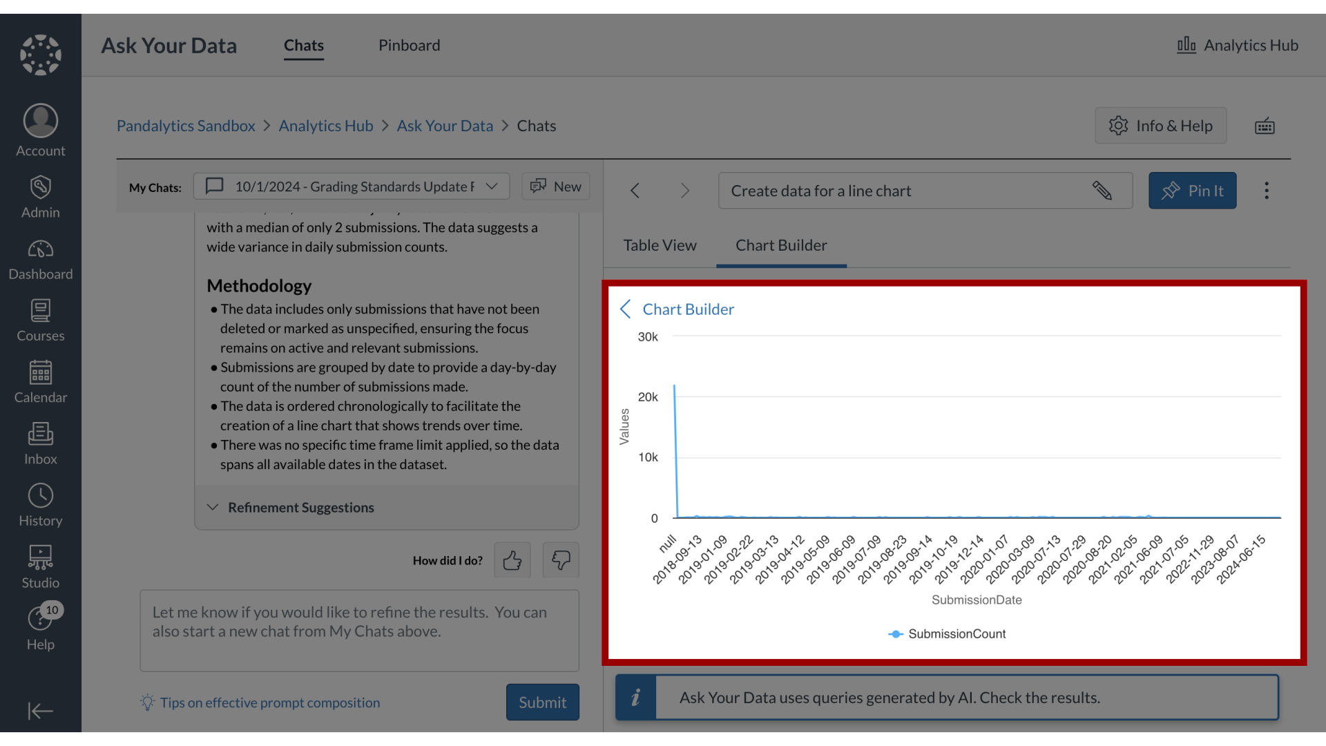
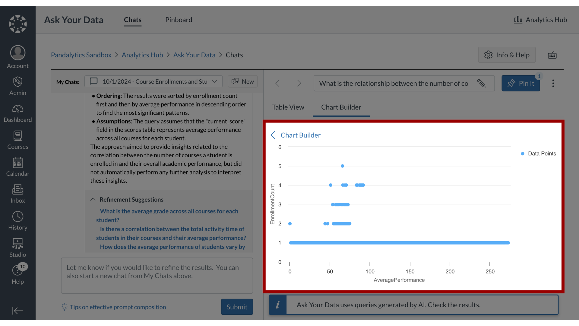
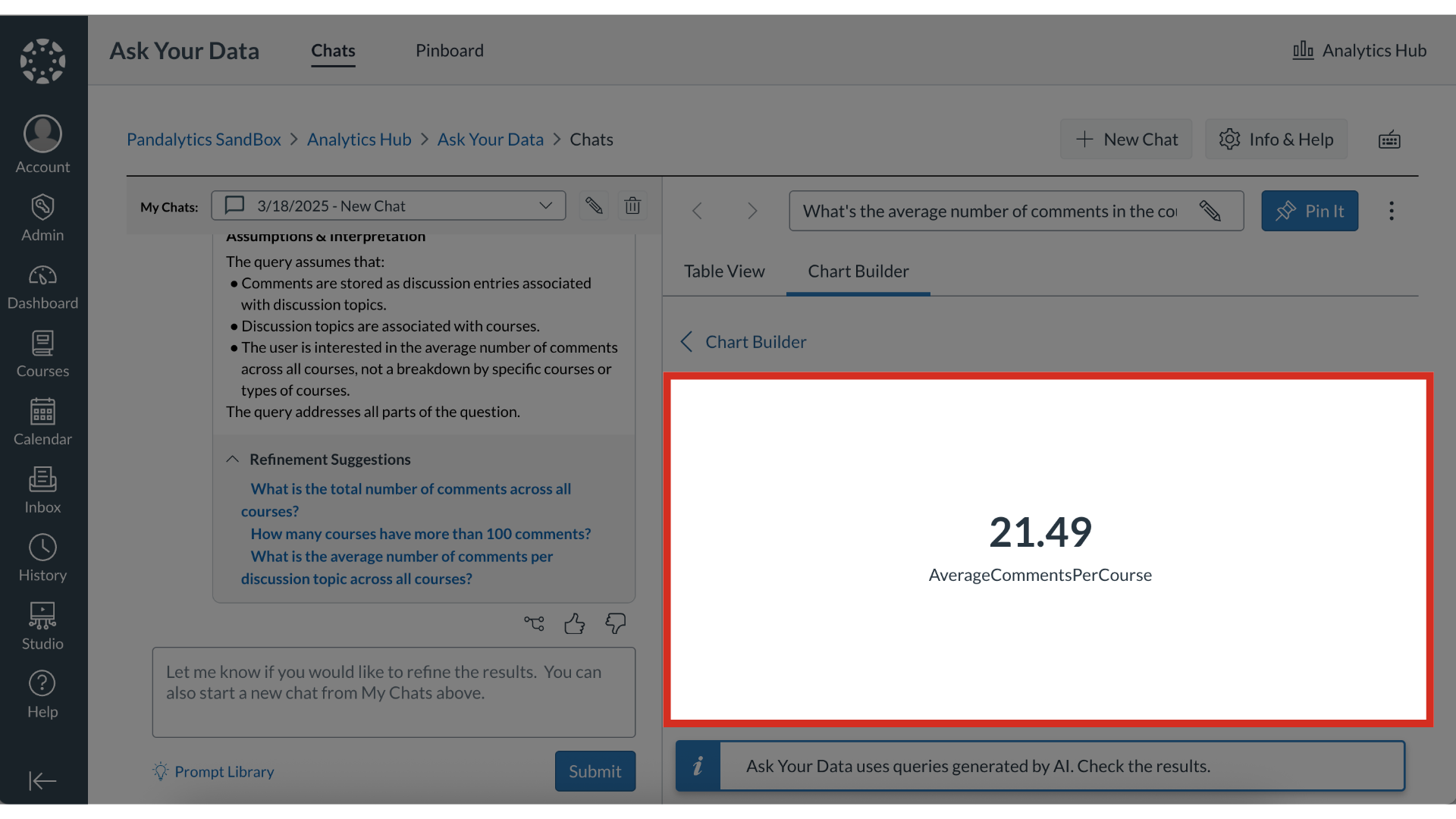
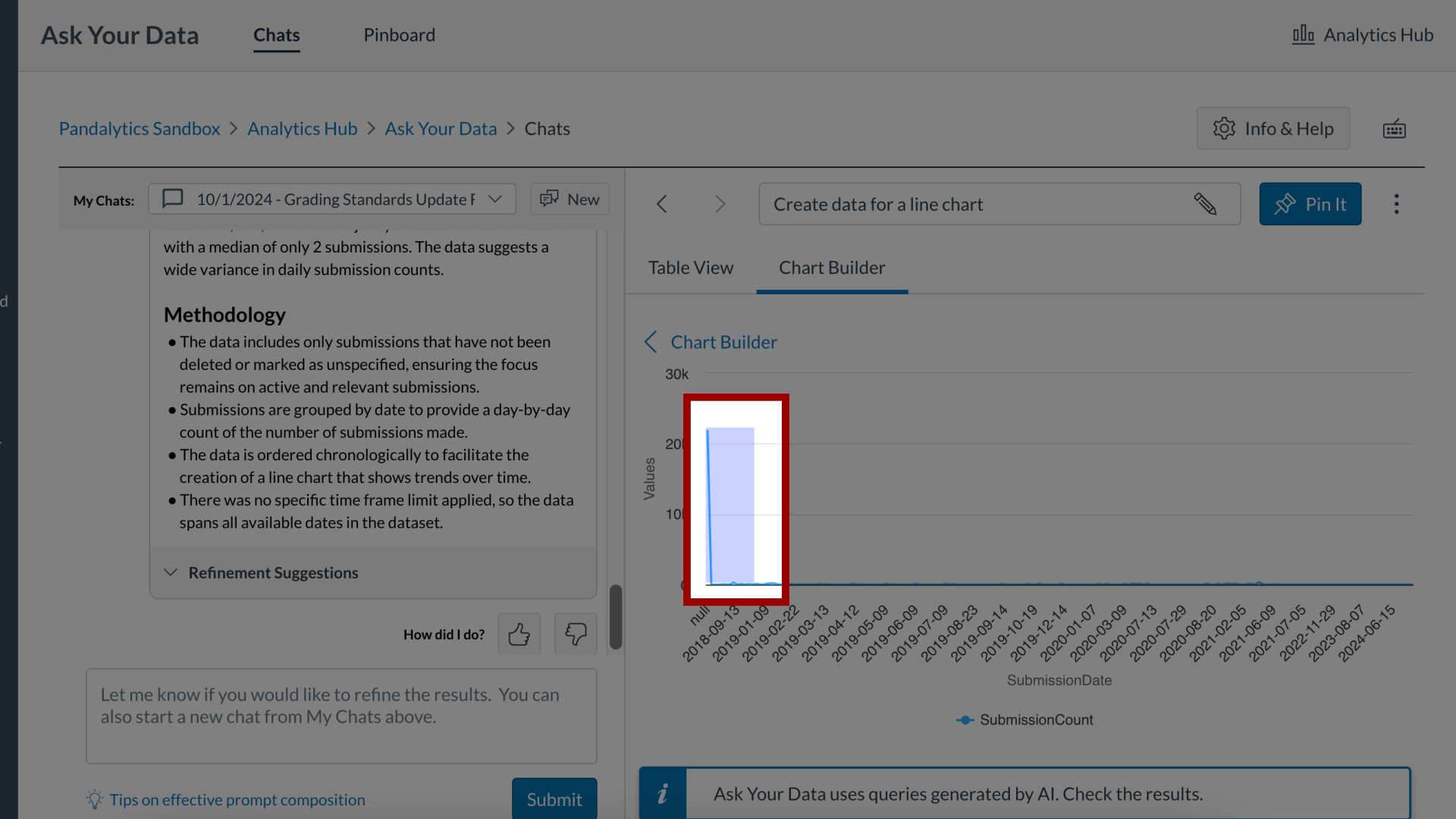
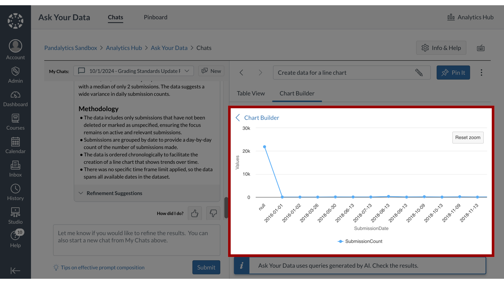
In Ask Your Data, you can easily convert your data tables into visual charts using the Chart Builder. Select from chart types like Bar, Pie, Line, Scatter, or Single Metric, then choose the relevant data types to generate visualizations that highlight trends and relationships. You can also zoom into specific areas of your chart for a closer look at your data insights.
Note: Sub-account administrators can use Ask Your Data (AYD) directly within their own sub-accounts, where AYD is scoped to display only the data relevant to that specific sub-account.